Monday 20 October 2014

Character Design

By Sara Nunes


References used:


Story boards

Story boarding/ Visual Interpretation by Hana Lau

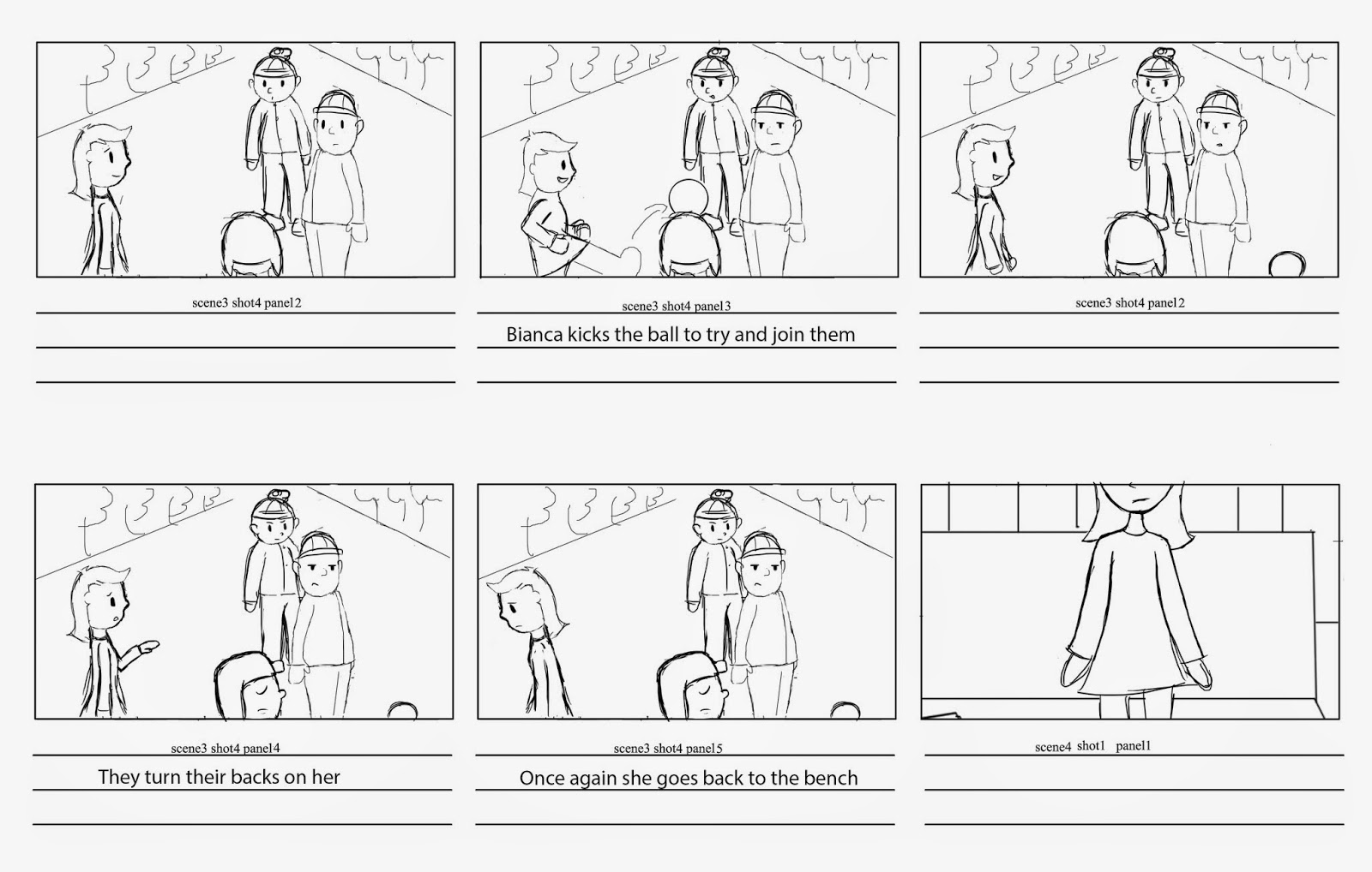
Alternative shots, I've only managed to do 3 shots at the moment - shots 01, 02 and 04.
I've also realized I've forgotten the pan in shot one, but I guess the alternative is one establishing shot with loads of posters (of 'coloured' celebrities) strewn about the room and walls and then a shot of the magazine shes reading through - then her looking out the window.

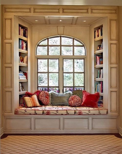
I've also altered the environment in shot 01 to have her reading on a window nook instead of her bed, I think this will make a better transition and won't cause a hassle of "how does she look out the window in quick manner?". I also like how a nook can portray how shes 'closed off' and shy to the world, as a nook is generally used as a quiet place to read.
Example of a window nook (pictured right)

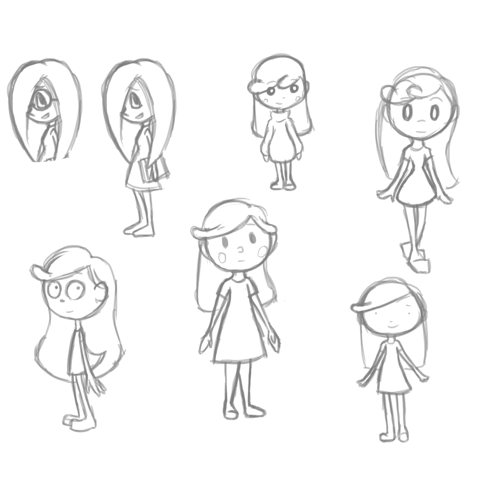
More alternative storyboards on the left.

Sunday 19 October 2014

Visual Development: 60's Inspiration

Research by Rebecca Warburton
The story of 'Colourless' is currently intended to be portrayed with an emphasis on colour. The form of the piece accentuates the protagonist's differences/ isolation by being white, compared to the rest of the world which is in full colour. Inspiration could be taken from the 60's decade which was full of colour and textures. Pop Art was a popular genre of art during the time; it often portrayed people abstractly with portraits of icons repeated side by side in different colours.
Collection of 60's posters secondary sourced from the internet
Collection of 60's illustrations secondary sourced from the internet

60's Patterns/ textures secondary sourced from the internet

Collections of Pop art sourced from the internet
Secondary sourced Collection of 60's style bedrooms

Secondary sourced Collection of 60's style bedrooms

Primary Sourced hairdryer and record from Doncaster Exhibition

Primary Sourced 60's dress from Doncaster Exhibition

Primary Sourced 60's dress from Doncaster Exhibition

Primary Sourced 60's tie and trousers from Doncaster Exhibition

Primary Sourced art from Doncaster Exhibition:
'Chromatic Mutations (1969)' by Timothy Armstrong
 The card reads: "In his 'kinetic constructions' Armstrong uses a mixture of coloured screen prints and curved Perspex to give a sense of movement as you walk past the image.
Timothy Armstrong studied at Nottingham College of Art and design, where his work was strongly influenced by his teacher Bridget Riley.
Construction and Silk Screen Print"

A collection of Bridget Riley's art work
Primary Sourced art from Doncaster Exhibition:
'Staten (1962)' by John Howlin

Primary Sourced image from Doncaster Exhibition:
Northern Bus Station and Car Park

Primary Sourced art from Doncaster Exhibition:
Doncaster: Car Park 3